Layout System
Description
The yeet layout system is based upon the Flexbox-System, but provides a miriyad of simplifications. The main difference can be found in the way as to determine the size of objects. However the following still holds true:
Items are arranged in Rows or Columns.
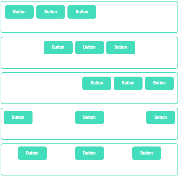
Items flex (expand) to fill additional space or shrink to fit into smaller spaces.
Every component in yeet is a flex item, additionally the yComponents yPage, yContainer and yPopup always serve as a flex container.
Flex sizing in yeet
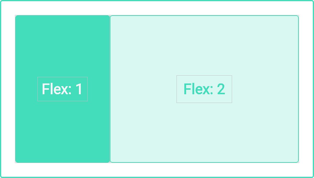
The flex property value (0,1,2,...) determines the size of the flex item within a flex-container, by putting it in relation to all its siblings.
Example: There are 2 flex items within a container, their flex values being 1 and 2 respectively => the spacing ratio is 1:2
=> The first item will occupy 33%, the second item 66% of the available space. Additionally you can set it auto, in this case the item is sized according to its width and height properties, but grows to absorb any extra free space in the flex container, and shrinks to its minimum size to fit the container.
Using the value 0 in conjunction with auto results in the component determining its size though its content once during the inital render.
The css properties min-width/-height and max-width/-height can be used in conjunction with the aforementioned flex property. Meaning the dynamic expanding and shrinking of a component is hard constrained within these two bounds.
This combination is the basis for providing a responsive multiplatform web application [SEE LAYOUT EXAMPLE].
Main- and Cross-Axis-Alignment
A main axis has to be defined in the flex-container through the flex direction property defaulting to column, the cross axis is always perpendicular to the main axis, in this case row.
Additionally each axis has an axis start and axis end part. The definition follows the standard western reading flow. Start being left/top while end is right/bottom, depending on the main axis.
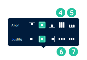
This can be leveraged in either the justify-content(1) (main axis) or align-items(2) (cross axis) properties.
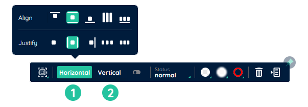
The following values are most commonly used in either property:
- flex-start
layout items from start to end - center
layout items from the middle on outwards to either side - flex-end
layout items from end to start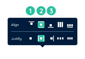
- baseline
All flex items are aligned such that their flex container baselines align. - space-between
exact same as space-around, except removing the space between outermost item and parent - space-evenly
items are distributed so that the spacing between any two items is equal. - space-around
evenly distribute all items starting from the center, while giving each item the same amount of space around them, additionaly leaving some extra space between the outermost item and border of the parent container
Flex-wrap
The flex-wrap property specifies whether the flexible items should wrap or not.
- nowrap
Default value. Specifies that the flexible items will not wrap - wrap
Specifies that the flexible items will wrap if necessary
Nesting
Flex containers can be nested. In this case the child container acts both as a flex item (size, alignment, order rules apply to this item) as well as a container (providing a seperate set of size, alignment and order rules for its children)
Layout example
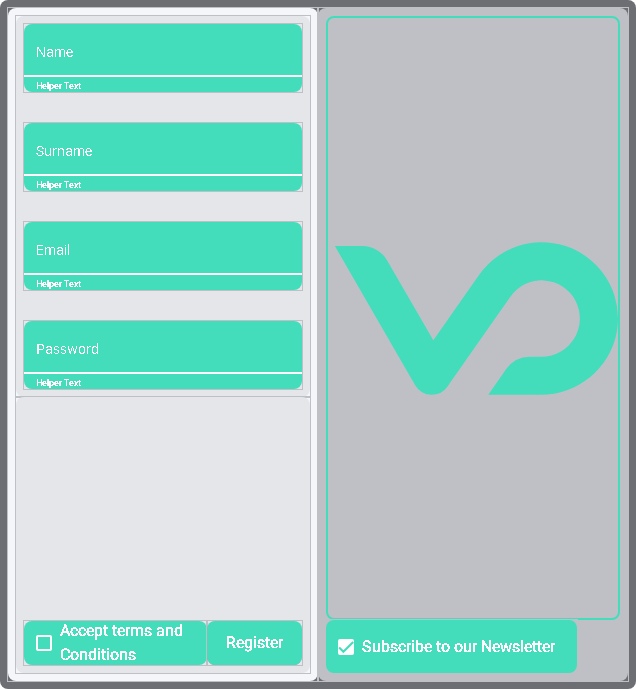
In order to create the above layout you'd follow these steps:
- Add two yContainers into an other yContainer and add another container into the lefthand container.
- Change the flex direction of the lefthand sub-containers into
columnand their justify-content values tospace-evenly. - In the upper-lefthand container: add a yInput for each required input field and change the label of each accordingly.
- In the lower-lefthand container: add a yCheckbox and a ybutton.
- in the righthand container: add a yInput for each optional input field, as well as a yCheckbox for the newsletter registration.